

Taco Madre
Por que madre solo hay una
Brand Identity, Product Branding & Interior Design
Taco Madre is a fast growing Mexican taco joint franchise in the Chicagoland area. Popular for it’s authentic and fresh ingredients, the franchise was looking to develop an identity as fun and authentic as it’s name.
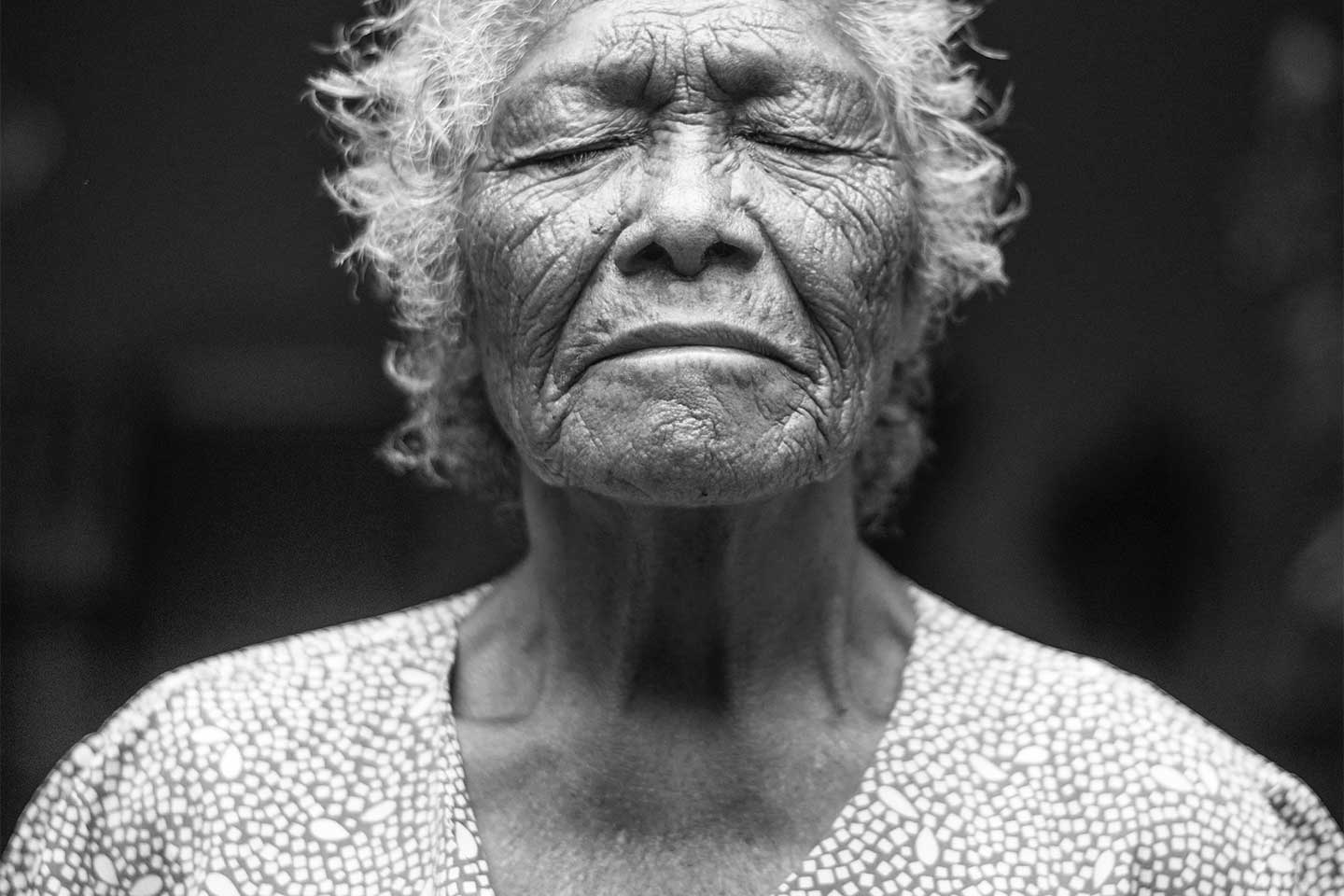
Taco Madre, means Taco Mother, and it’s popular tagline “por que madre solo hay una” translates to “because we only have one mother.” The tagline is a nod at the menus’ authenticity and the love in which it is created by. When creating the brand’s logo, the queen of hearts was the perfect way to showcase what Taco Madre represents: mom, the queen of all hearts. We chose yellow as the brands primary color to represent the corn used to make tortillas–the most popular staple in Mexican cuisine. For the interior, we went for a, contemporary meets semi-industrial, Mexico city street taco look, and chose minor folklore elements along with it.
![]()
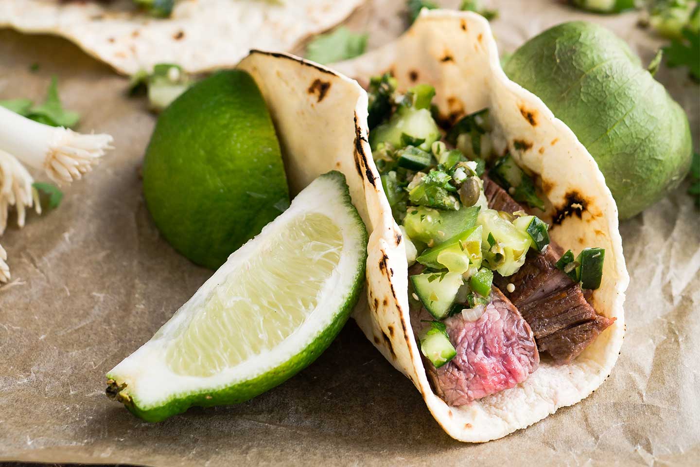
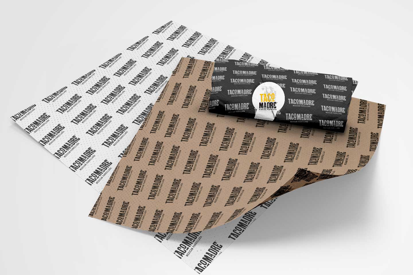

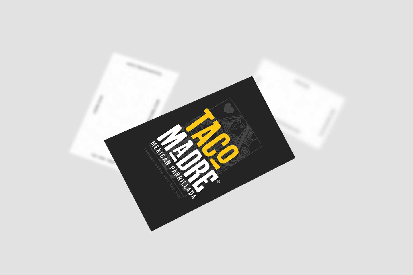

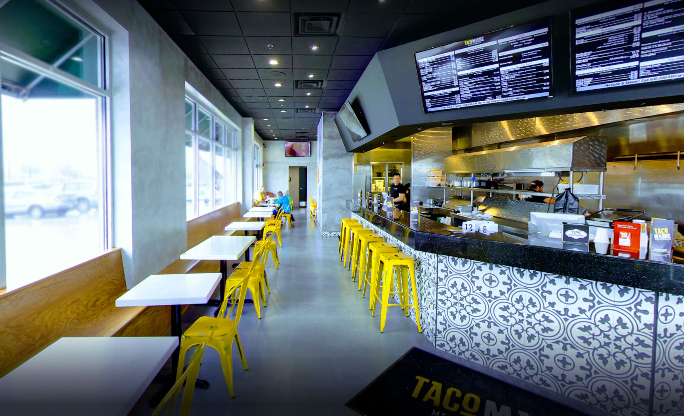 Photo Courtesy of Taco Madre, St. Charles IL